How much do you know about your delivery customers? Do you know what neighborhoods they live in and how far your typical delivery is?
One of the advantages of in-house delivery is the wealth of customer data collected. For each delivery order, a customer contact file is created or updated in your point-of-sale system. The data can then be used for marketing campaigns, monitoring performance, and for setting delivery zones and prices. But how do you interpret it?
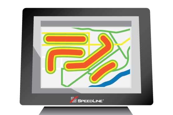
Heat Maps
An excel sheet with thousands of rows detailing each delivery your restaurant made in the last year is not something you can easily glance at and understand. In order to quickly interpret the information pulled from your point of sale, SpeedLine LiveMaps uses visual "heat" maps. Heat map reports display report data in a visual format overlaid on a map of your trade area. For a Sales Total report, the colors represent how many dollars in sales went to that area in the time period you chose. Map delivery performance to tune up your delivery service, map lazy and frequent customers to target VIP or bounce-back offers, or map coupon use to target door hangers. There are 15 different heat map reports to choose from.
The LiveMaps heat maps feature increases the user-friendliness of the heat maps and made them faster and more accurate—values are now displayed as a gradient rather than as a grid.